
Poster fonts are typefaces designed to grab attention. They’re used in large formats—posters, flyers, banners—where the typography itself often carries much of the visual weight. These fonts might be display type, decorative, or stylized in ways that make them stand out from more utilitarian body text fonts. At TypeType, poster font is a category of typefaces crafted with commercial usage in mind: recognizable, visually engaging, and technically strong.
Why Poster Fonts Matter
In design, especially promotional or large-format work, the choice of font can make or break effectiveness. Posters are often viewed from a distance, in passing, or in crowded visual environments. The font must:
- Be legible at large size
- Convey a mood immediately
- Often serve as both text and visual ornament
Poster fonts aren’t just about beauty; they also have to meet technical requirements: proper licensing, trial versions, multilingual support, and quality design. TypeType ensures their poster font catalog includes these features.
See also: Tech transformations making airport security seamless and safe
Key Features of Good Poster Fonts
Here are features emphasized by TypeType when selecting or designing poster fonts:
Expressiveness & Display Qualities
Fonts meant for posters often have bold, unusual, or experimental letterforms and proportions—narrow, wide, or dramatically stylized—to catch the eye. For example, TT Trailers is described as an expressive display sans serif with extra narrow proportions.
Versatility Across Themes & Contexts
A good poster font works in different genres (advertising, events, promotions, cultural, etc.). TypeType fonts like TT Norms Pro and TT Commons are praised for their flexibility—usable in posters, flyers, and more neutral background text.
Icon Sets and Additional Graphics
Some poster fonts come with built-in iconography or decorative glyphs. For example, TT Trailers includes a movie-themed icon set (popcorn, seats, screen, etc.), which helps designers enrich posters without sourcing separate graphic assets.
Multilingual & Style Support
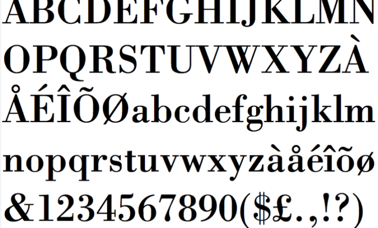
Since posters are used everywhere, fonts must support many languages and scripts. Also designers often need multiple font styles (weights, widths, etc.) to create hierarchy and visual contrast. TypeType emphasizes that their poster font options support both Latin and Cyrillic languages.
Trials & Licensing
TypeType makes trial versions of all their poster fonts available so designers can test in actual projects before purchase. Licensing is obviously important for commercial applications.
Examples from TypeType’s Poster Fonts
Here are some specific poster fonts from TypeType and what makes them special:
- TT Trailers: An expressive display font, originally inspired by film industry uses. It has narrow proportions and includes themed icon sets. Great for showy, bold poster headers.
- TT Travels: A wide geometric sans serif that balances boldness with adaptability. It’s used in settings where the text needs to stand out but not dominate painfully; it functions both with graphics and by itself.
- TT Firs Neue: A minimalistic Scandinavian sans serif. Clean, modern, but with enough character to serve as a focal point in poster design.
- TT Commons: Highly versatile—can be used solo or paired with visuals. Serves well in neutral or more decorative posters.
- TT Espina: A display of Antiqua with expressive serifs. Good for themes like folklore, esoteric, or decorative poster styles. Adds a decorative mood.
Conclusion
Poster fonts are powerful tools in the designer’s toolkit: bold, expressive, emotionally charged, technically specified. According to the TypeType Poster Fonts category, the best poster fonts balance expressiveness with functionality—good legibility, style variety, multilingual support, licensing clarity, and extra decoration or iconography where appropriate. When used wisely, a well-chosen poster font doesn’t just communicate text; it elevates the entire design, turning posters into statements.